Embark
The strategy, story, and visual system behind a community-first residential development.
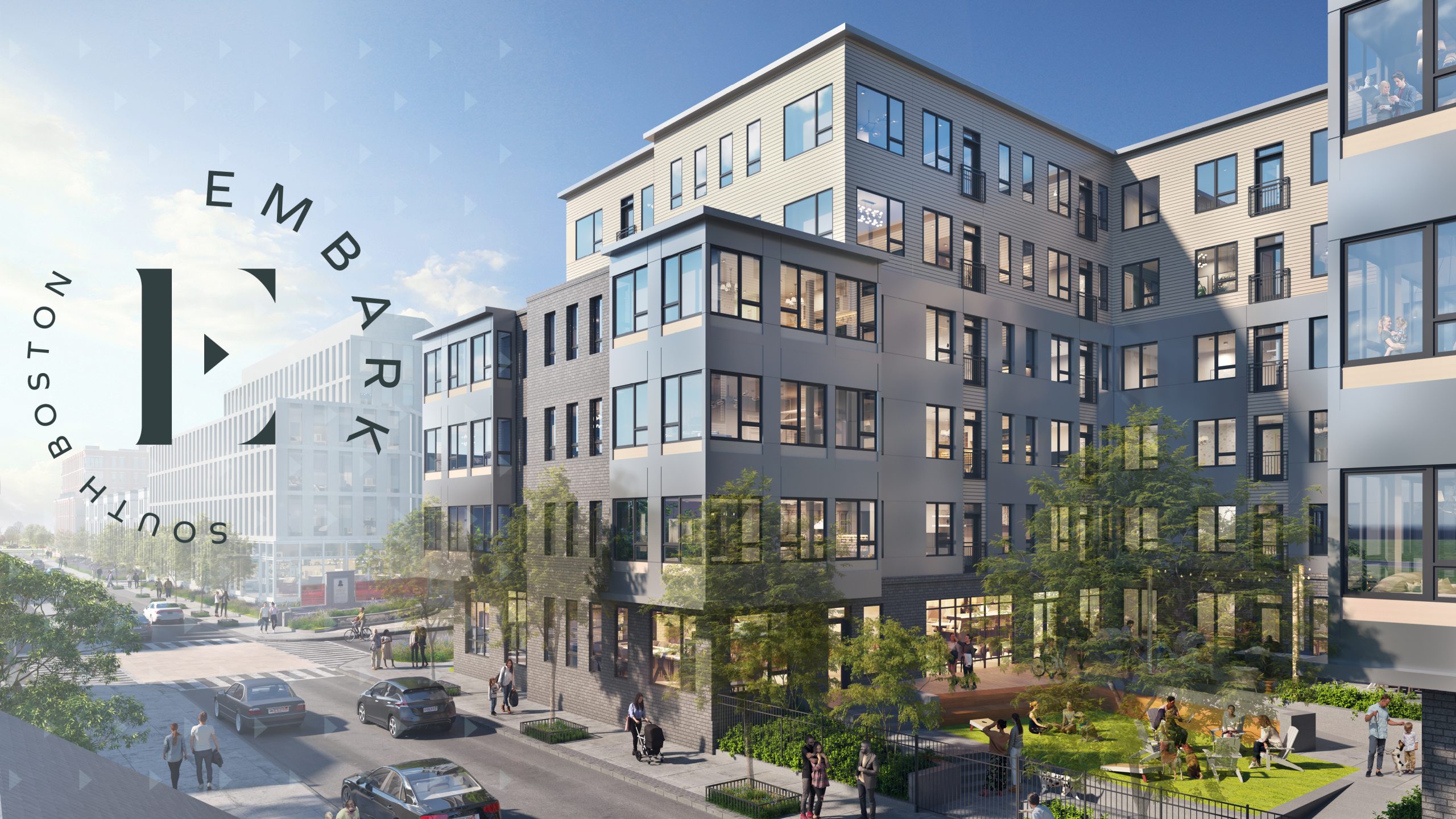
Mary Ellen McCormack was built in 1938. It was the first public housing community constructed in New England, set in South Boston’s tight-knit, Irish-American enclave. Today it’s home to a diverse, multilingual resident base.
WinnResidential is leading a multi-year transformation of the property into a modern, mixed-income neighborhood — a bold project designed to revitalize a longstanding anchor community. They came to Resident360 with a clear challenge: create a contemporary brand that generates excitement for prospective residents and investors, while authentically honoring the history and pride of place felt by long-term community members.
Achieving that balance meant building a brand that drives meaningful progress forward without treating the neighborhood’s rich heritage as something to leave behind.
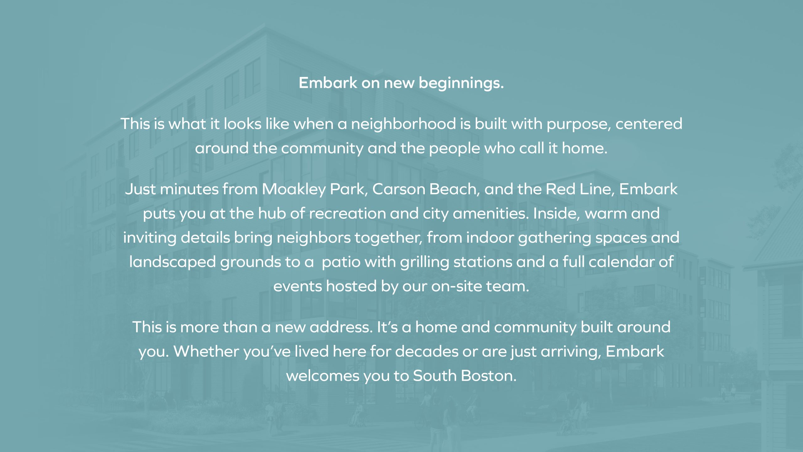

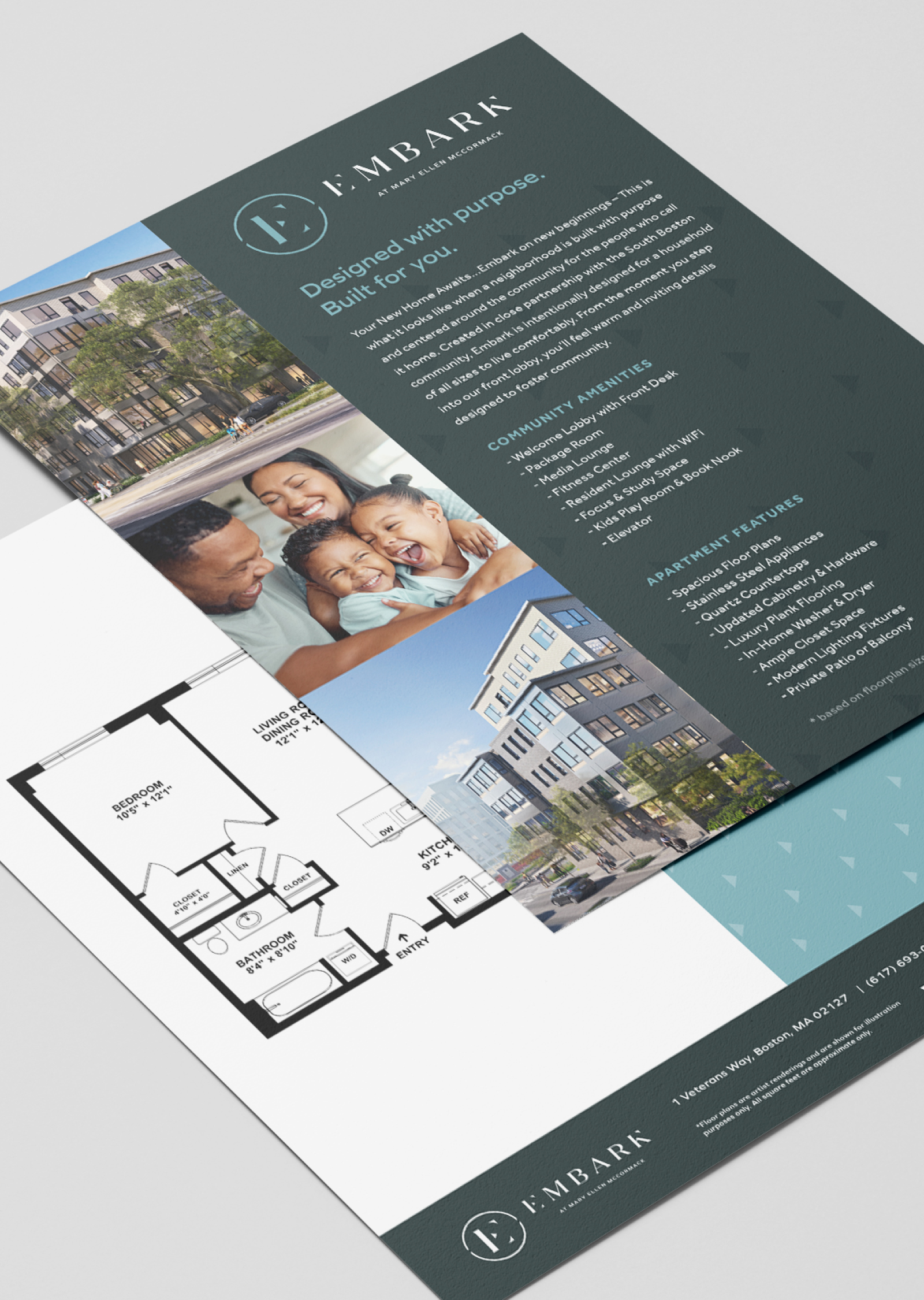
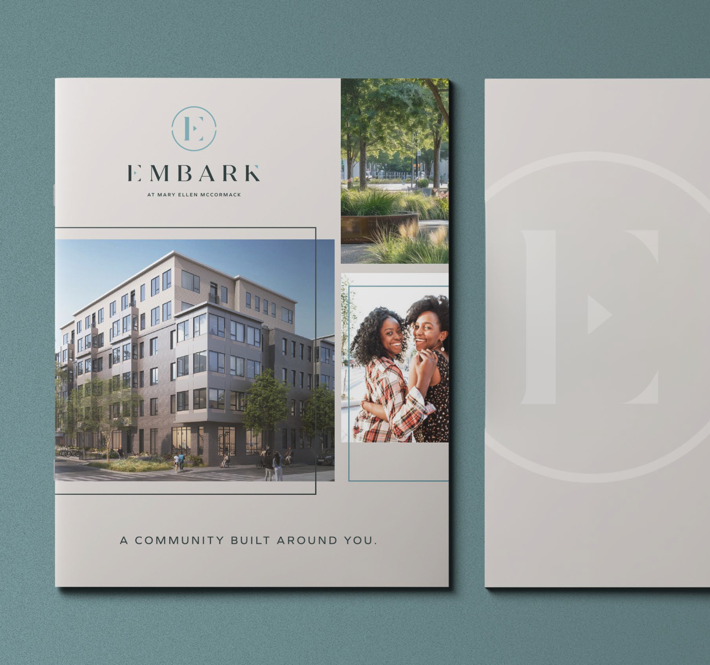
We approached Embark as a brand strategy challenge first, laying the foundation for a complete visual and messaging ecosystem. The core messaging was structured around an intentional hierarchy: A bold new chapter. Designed with purpose. Built for you. A community built around you. Each line serves a distinct purpose — capturing the broader neighborhood transformation, emphasizing intentional design over generic luxury claims, and keeping the focus squarely on resident quality of life.
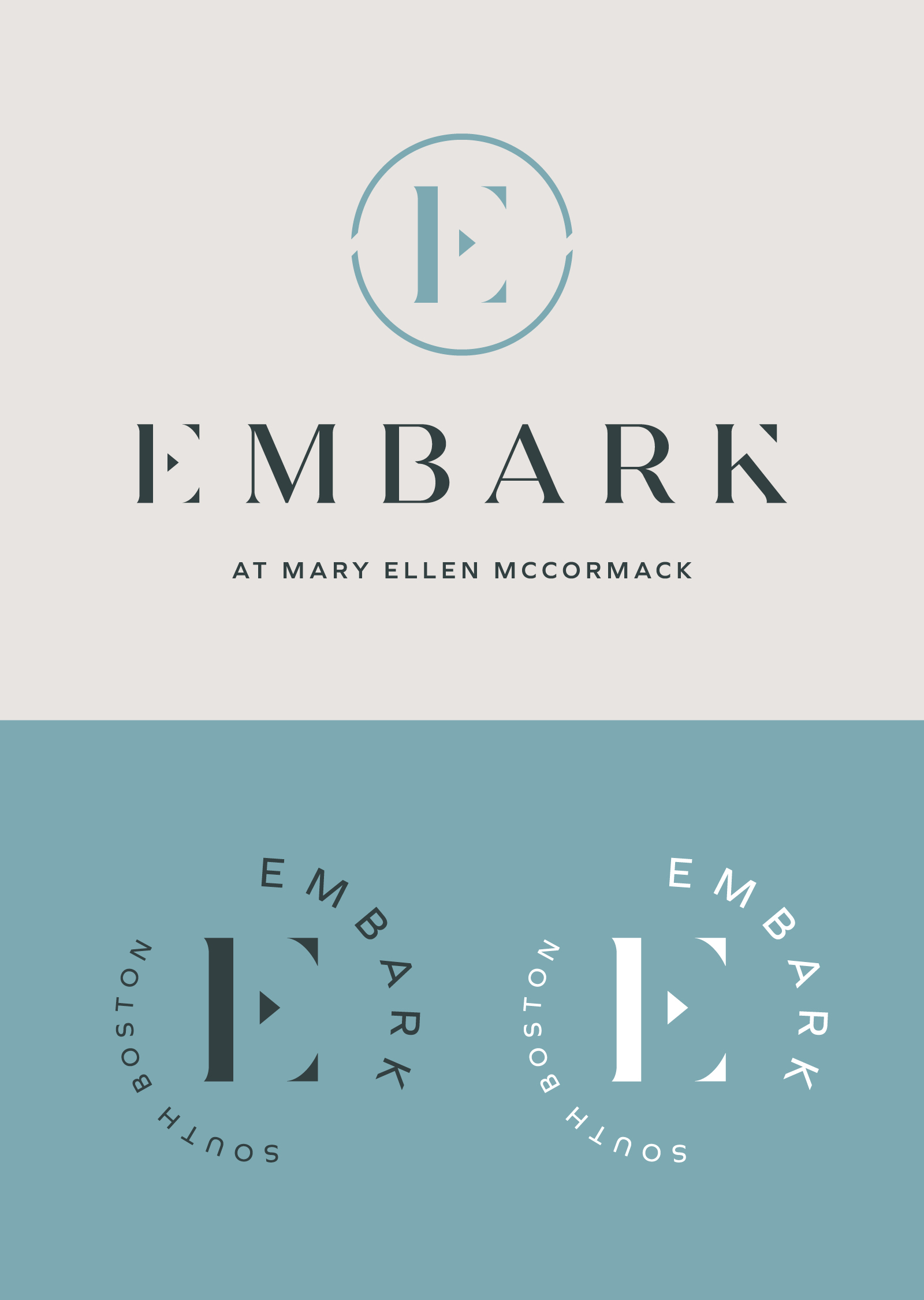
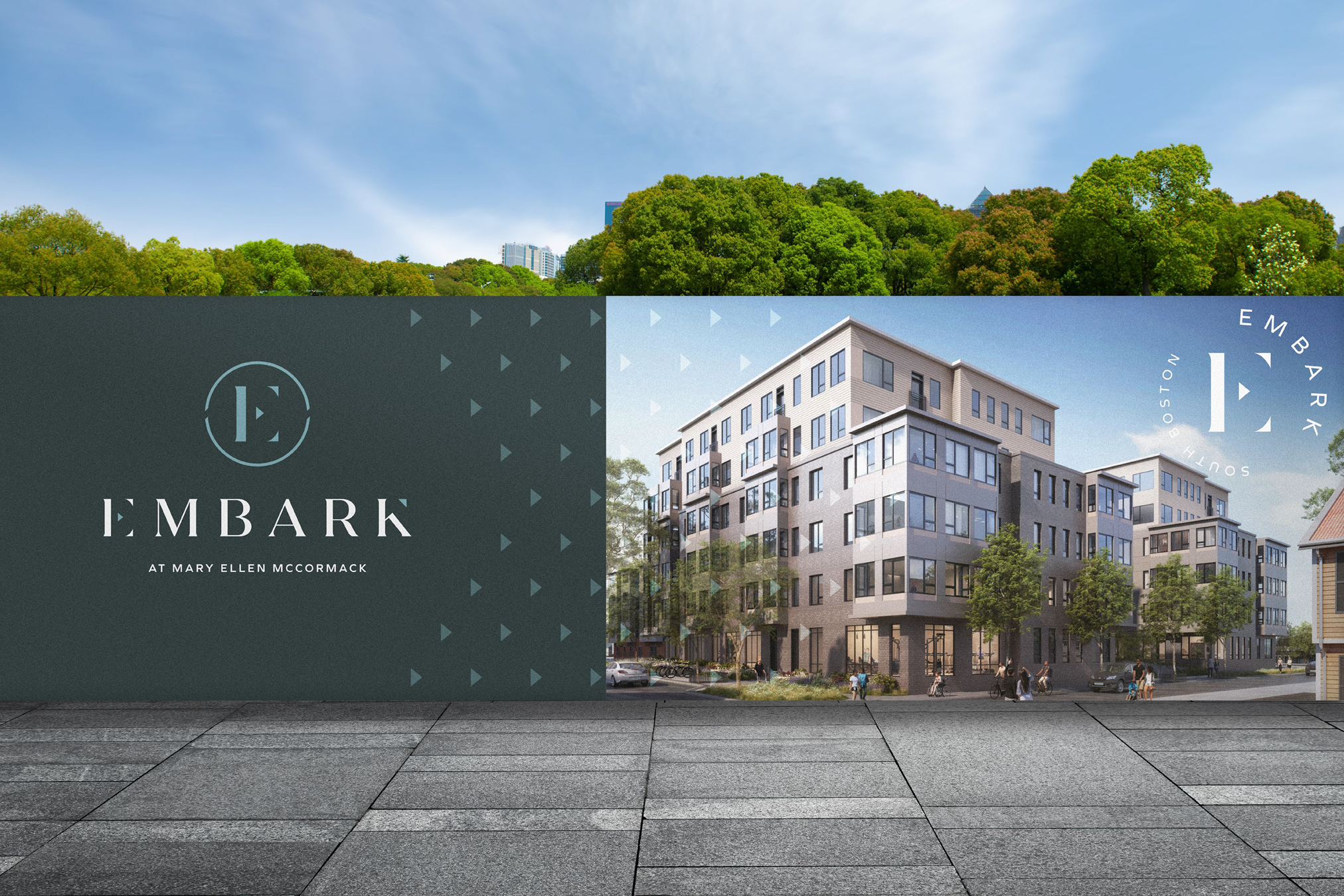
The primary logo balances movement and transformation with a warm approachability. Its deconstructed “E” mark incorporates a subtle arrow, giving it a modern, architectural edge, while gentle curves and subtle serifs in the wordmark keep it inviting and residential.
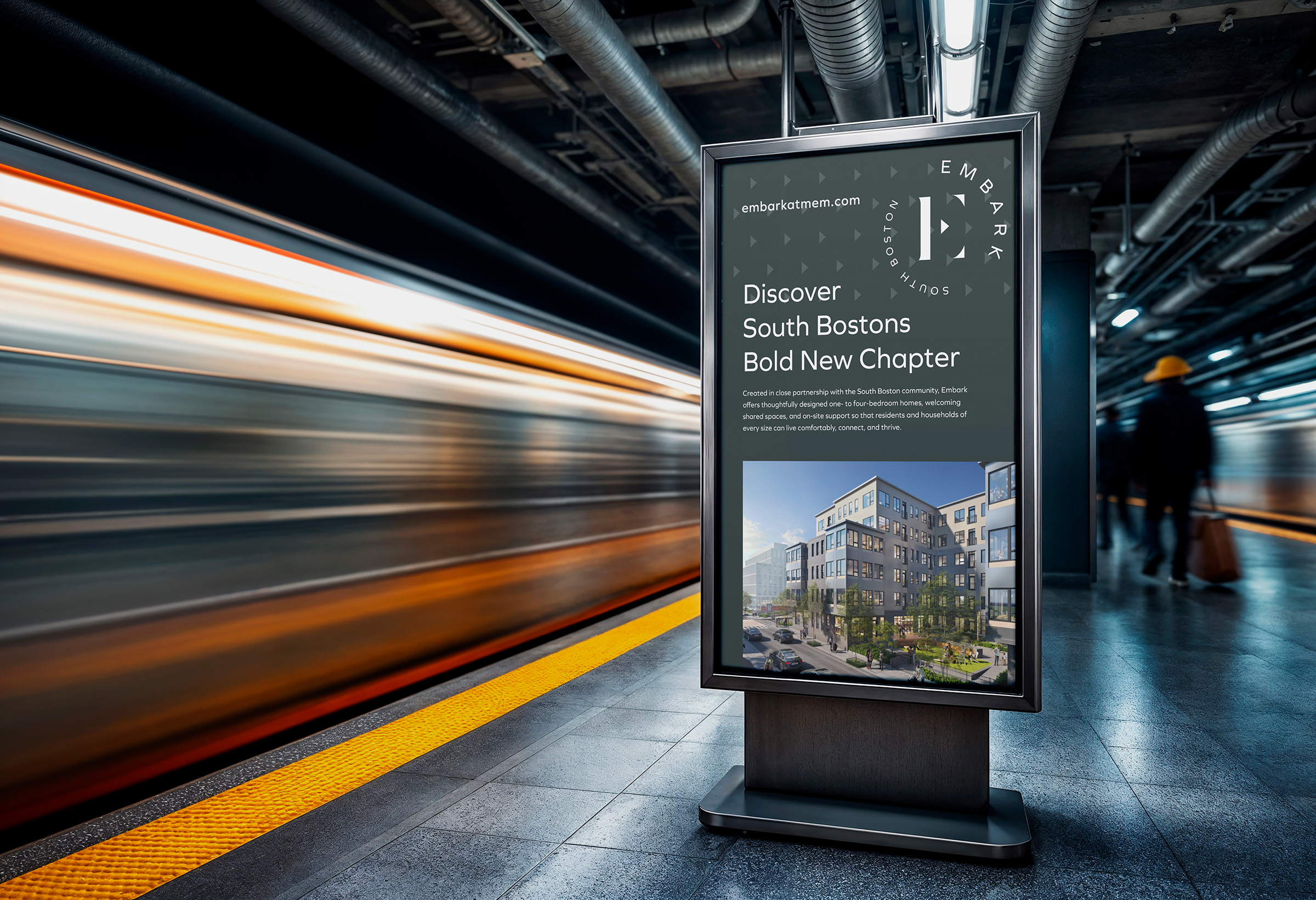
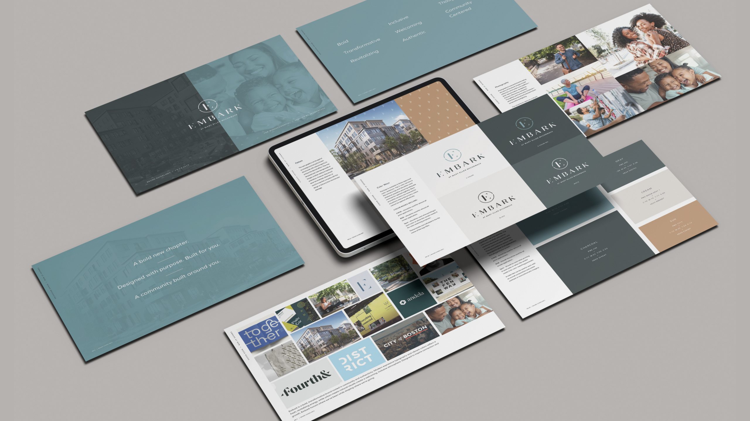
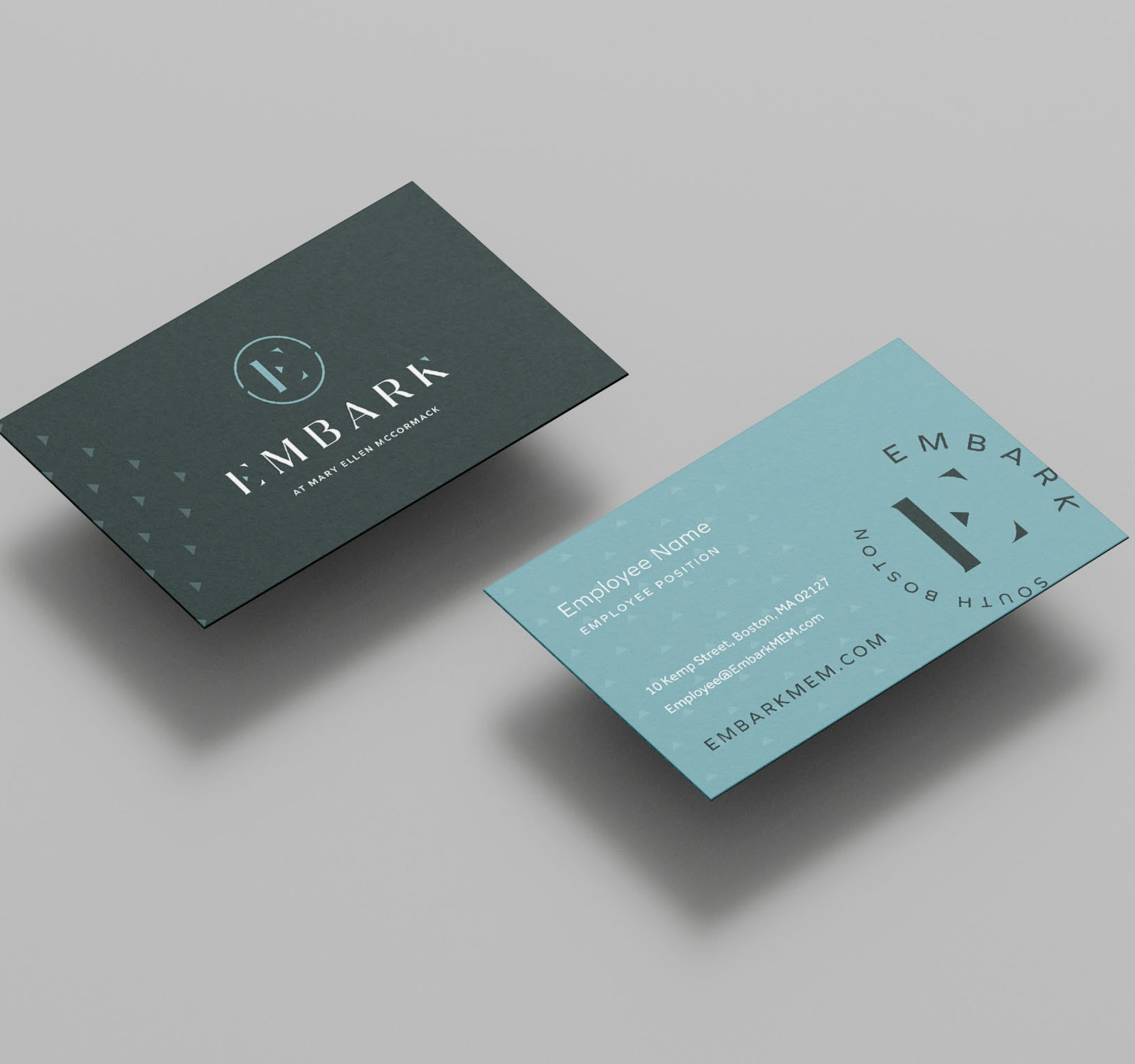
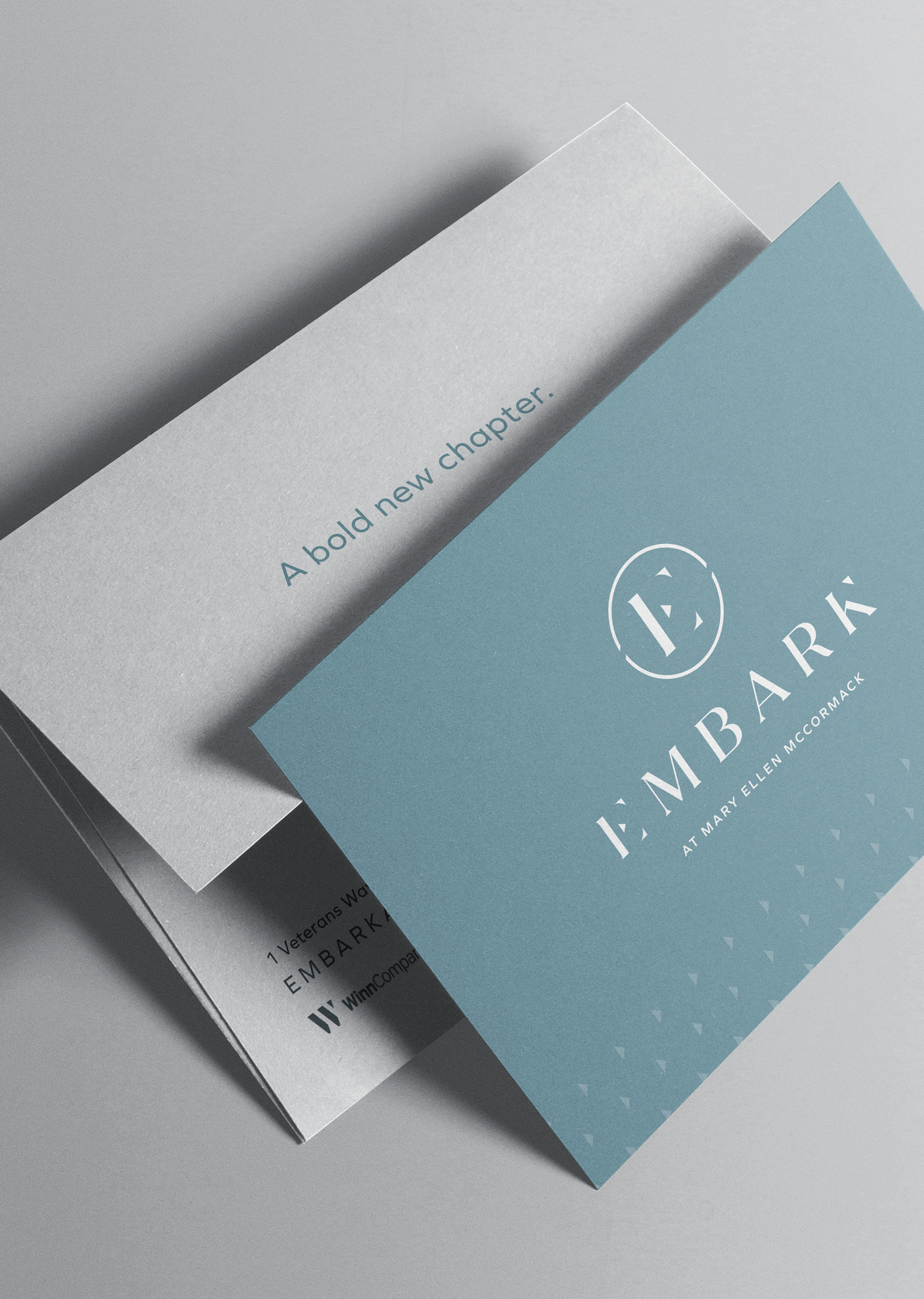
The brand’s expression through color, pattern, and typography reinforces this idea of transformation, while reflecting the support and momentum residents experience along their journey.